

DESCRIPTION
Design a website homepage using a grid.
PROCESS (Programs, Tools, Skills, FOCUS principles)
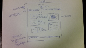
1n First I sketched out some basic layouts to include the required elements. I’ll note here that I did not have my audience in mind as I did this, and you’ll see how this will come back to bite me later. I liked my sketches, and I decided to put one to work in the form of a wireframe.
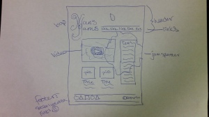
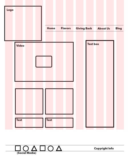
However, when I finished my (very) rough draft, I frankly hated it. It had nice qualities – good amount of collected white space, color theme, etc. – but it just wasn’t cohesive.
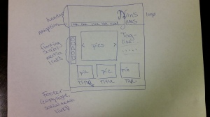
I wasn’t sure what it was exactly, but I just couldn’t seem to “fix” it enough. So I threw everything out the window and started completely over. And here’s where I did what I should have done in the beginning: I did my research. I searched for other jams’ websites to see what worked and what ratio of text to images I should be using. What did their headers look like? Did they use columns? How many? How did they incorporate their color scheme?
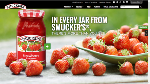
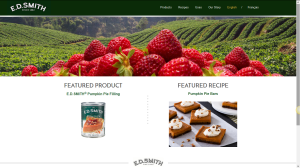
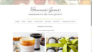
I researched Smuckers, E.D.Smith, and Bonnie’s Jams, and I found many similarities between the first two; namely, a solid and small header bar, a smaller-than-I-thought logo, pictures as integral, full-width elements, and equal amounts of real estate given to pictures and text.
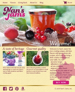
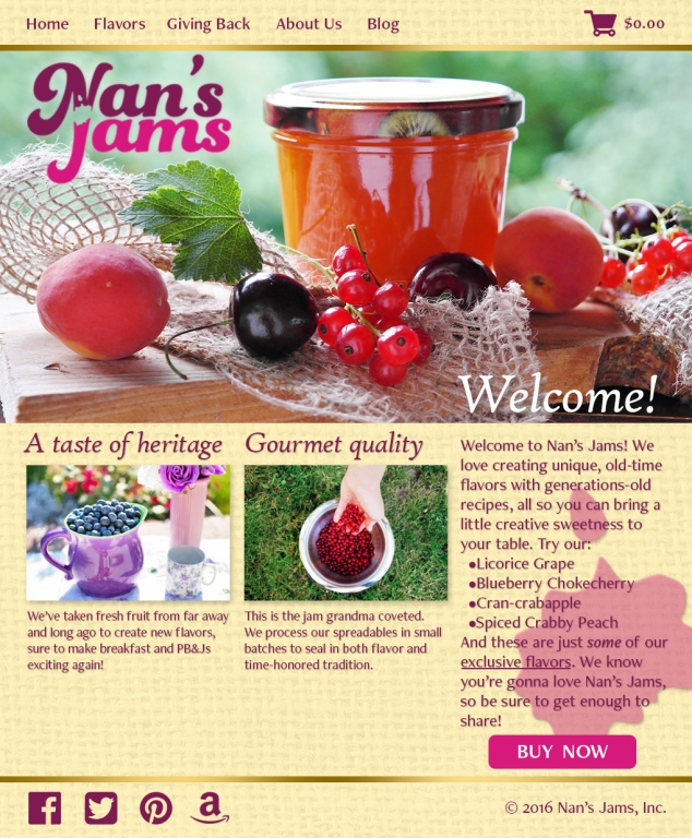
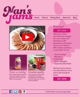
I took a few of my ideas and elements from the first Nan’s Jams page and modified them to fit the new vision. I chose to utilize the original color scheme for main elements, but I used a complementary color for the background (a golden color; complement of purple). I also customized social media icons for this site. I changed the specific fonts (though I didn’t stray too far from the categories). I added a burlap texture to the background, which goes nicely with the main picture.
I much prefer this version of the website. I do feel I could make it less busy, but as it is, I think it’s closer to “finished” than my first draft.
CRITIQUE PROCESS
I got a mixed bag of thoughts from those who commented on Facebook. Some ideas were to make the background white (others wanted to keep it pink), the jam splotch is nice, the header could be just one color and the rest white, make the buttons stand out more, ditch one of the buttons, and the jar in the leftmost picture looks lonely 🙂 My husband James agreed that it looked too pink, but he didn’t like a solid background either.
Facebook Critiques: Julie Baughman, Heather Holt, Brad Campbell, Chearston Webb
One-on-One Critique: James Duncan
Instructor Critique: I think Brother Stucki overdosed on pink when he looked at my initial draft! I’m glad he brought it up, because that was a big reason why I didn’t like the first draft. He also advised me to look at alignment and spacing, down to the nitty-gritty. Additionally, Brother Stucki suggested back in week 7 that this color scheme is more monochromatic than analogous (as I thought it was), so I made that adjustment mentally, which helped me discover how gold could be used as a complementary background color.
MESSAGE
Having Nan’s Jams is like going to grandma’s – it’s well made and tastes good.
AUDIENCE
Connoisseurs of unique condiments.
TOP THING LEARNED
Don’t be afraid to chuck everything – even the drawing board – and start over.
COLOR SCHEME & COLOR NAMES
Complementary // Magenta, purple vs. gold, cream
TITLE FONT NAME & CATEGORY
High Tower Text // Oldstyle
COPY FONT NAME & CATEGORY
FreightNeo Pro // Sans Serif (medium transitions)
THUMBNAILS OF ANY ORIGINAL, UNEDITED IMAGE(S) USED IN THE PROJECT
SOURCE OF EACH IMAGE (website name and hyperlink)
Logo is my own.
Blueberryhttp://eatrightmama.com/blueberries-for-breakfast/
Jar
pixabay.com
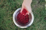
Pouring berries

Miranda,
You totally nailed this project. I liked the pink page, but this one really takes the cake. You must have had a lot of extra time to do the make over. I love the background texture, the new pics that add so much color and vibrance to the page. I love your fonts and layout. Keep up the good work.
Jeremy Taylor’s Blog:
My Blog:
LikeLike
I loved that you checked out the Smuckers website and saw what worked for them and adjusted your website mockup to reflect some aspects of the Smuckers site that you liked. I thought you did a great job with not only your website, but your logo. I loved the splotch of jam that is cut out of the text, it’s genius! I also like the images you chose. Fabulous job!
Here’s my web page mockup for you to check out: https://hannahungricht.wordpress.com/design/web-page-mockup-project/
And the person I love to stalk her webpage the most: https://heatherhholt.wordpress.com/2016/11/16/web-page-mockup-project/
LikeLike
Miranda,
I am so impressed with your finished product! It can be frustrating to scrap a whole idea and do something different. In the end, though, it turned out amazing! The images are really titillating! The jam looks so delicious, I want to order some! I like how your jam splatter bleeds off the right edge of the page. Overall, really nice work!
Check out Julie’s awesome page here: https://juliebaughmanblog.wordpress.com/2016/11/16/web-page-mockup-project/comment-page-1/#comment-23
And see mine here: https://chelsiebradycomm.wordpress.com/2016/11/17/10-a-web-page-mockup/
LikeLike
Miranda, once again you’ve done a great job with your project. I like that you checked out other sites in your niche to get an idea of what they were doing. That’s a great way to figure out what is working and then make it your own. Your very nice full-width photo is a great idea, and I like that you’ve placed the navigation at the top out of the way, but easily accessible, and that you’ve got the shopping cart included on it. Great job overall!
I really like Julie’s simply design at https://juliebaughmanblog.wordpress.com/2016/11/16/web-page-mockup-project/comment-page-1/#comment-24, and you can check out my design at http://redirwin.com/web-page-mockup-project.
LikeLike
You did such a great job! I love your color scheme. The images you used were great as well. They really brought the colors together. It makes these treats seem very appealing. Nice work.
My Blog: https://carliescommunicationblog.wordpress.com/2016/11/19/web-page-mockup/
Wendys Blog: https://wendyholcombcomm130.wordpress.com/
LikeLike
Wow. I’m totally blown away. I love the pattern in the background, and the color scheme is on point! Fantastic images as well – they’re nice and bright.
LikeLike
How fun your finished site looks. I love all the changes you made. I liked a lot of things from your draft too but this is even better now. I love your deep purple social media. Sometimes its hard to start to toss the old and bring in the new. Love it! Check out mine at https://thewebbdesign.wordpress.com/category/designs-comm130/ I would love any critique since I am hopefully going to use it for a website. I have a hard time bringing in the new ideas.
LikeLike