

PROJECT CORRECTIONS/TIME SPENT
I spent a little over two hours making corrections according to the feedback I received from Brother Stucki when he graded each assignment. Specifically:
-50 minutes adjusting the size and alignment of the photo montage text
-20 minutes moving “STEEL” from overlapping other words; changing position of “Blue” and deleting unaligned color swatch on the photo design project
-55 minutes changing fonts, alignment, colors, and adding drop shadow effects to the magazine cover
DESCRIPTION
Design a portfolio that showcases all projects from my Visual Media course.
PROCESS (Programs, Tools, Skills, FOCUS principles)
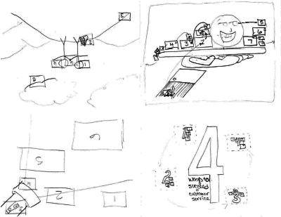
I started by researching various online portfolio designs and found a few with elements I liked. I sketched a few designs and began drawing them up in Illustrator. I soon realized that it would be better to have the concept drawn up in InDesign because I wanted certain elements on some pages and not on others.
I added all elements to the master pages and had to research how to edit master page text boxes on regular pages (ctrl-shift-click on the text box – that makes it editable). I then moved various text elements around until I found something that worked. I played with the colors and alignment. I changed each project description page’s title and other specific information to correspond with that project; then I placed each project image.
CRITIQUE PROCESS
I received feedback from Brother Stucki, noting that the simplistic and geometric elements fit well with a portfolio design. Brad Campbell, Chelsie Brady, and Chearsten Webb commented on FaceBook regarding there being too much text, needing more texture, and various alignment concerns. I loved every point they made and made several changes, including adding a texture to the grey shape. I met with my sister Jennifer to discuss the color scheme and alignment and made further adjustments to text box positions to generate more natural white space.
MESSAGE
I want to showcase my work in a professional and accessible way.
AUDIENCE
Potential client and employers.
TOP THING LEARNED
I have more resources than I think – don’t settle until I tap various sources.
COLOR SCHEME & COLOR NAMES
Monochromatic // Blue, grey, and white
TITLE FONT NAME & CATEGORY
Mr Eaves // Sans Serif
COPY FONT NAME & CATEGORY
Museo Slab // Slab Serif
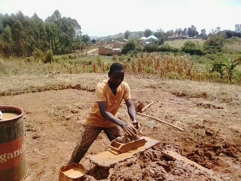
THUMBNAILS OF ANY ORIGINAL, UNEDITED IMAGE(S) USED IN THE PROJECT

SOURCE OF EACH IMAGE (website name and hyperlink)
Freevector


 lilac #F7B3D0
 magenta #D61A7C
 plum #7F1A52


 I wanted a script, so looking through available fonts was necessary before I went much further into the sketches.
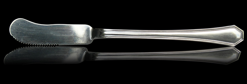


 Freestockphotos.biz
 Flickr.com
